Post by lorathor on Oct 21, 2014 23:05:19 GMT
General Infos about spriting:
• Output Format: 32 bit .png
• Transparent background
• Sprite animations in one file
• Min/max frames per animation about 7-20 (depends on sprite)
• Animation arrangement is left to right
• Sprites without animation first, followed by it's animation
• Start of another animation has to be done in the next row/layer
• Smaller animations/sprites in different colors as every sprite on it's own
• Bigger animations/sprites in greyscale where the color needs to be changed for massive differences
• Greyscale color starting at RGB: 10,10,10 and rising.
• Small Items and Object may have a 1 or max. 2 tiles frame with almost 1% white opacity
• Objects can be bigger than 1 tile (48x48) - example: Cloning pod, sleeping pod, ect.
• Mobs aren't restricted to 48x48
• 24 pixels are ~ 1m / 16 pixels are ~ 2 feet
• Orthographic orientation
• 4-directional items
• Light goes from top left to a shadow at bottom right
(all of the following pictures are only examples about the procedure)
Sprite and animation layout:

Animation pattern for a PDA. Top row, first sprite may be a 2 minutes long still. All of the following sprites in this row are the animation with a time period of 0.2sec each.The other rows are animation examples of two different kinds of personal PDA's with and without a present message and a moving text on the display. If you want to tell the coders or other spriter what you thought about an sprite or animation, just add another Last row to the .png and explain further. Let's say you have a animation like the PDA's top row with different time periods. Add another 48x row at the end and write down: " Row 1: Sprite 1 is 2:00 minutes long Row1: Sprite 2-7 are 0.2 seconds."
Greyscale explanation:

When a higher difference of colored items is needed, greyscale color changes are the best solution. The greyscale starts at RGB 10 10 10 and goes
higher for every color added. In this case the coders may add a high variety of colored devices with only 1 sprite (if it is a still like clothing)


Simple as it is, just add a 1 or max. 2 tiles wide outline to a small item with a opacity of 1%. In this case I brightened up the outline
for showing purpose.
Artstyle:
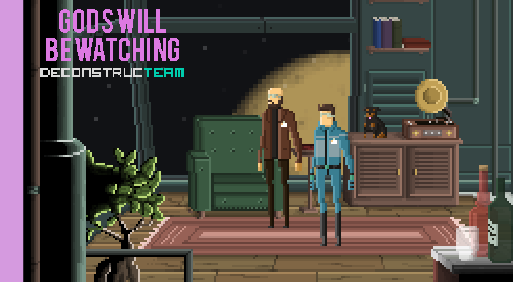
As stated by Nullbear, buildstation is going for a similar look like the games "Gods will be watching", "Risk of rain", "Paradise Lost", and "Superbrothers: Sword and Sworcery".

1. We don't need no black borders around our sprites. It makes the whole thing kinda 'off'. Sure, when the overall design is build up with
borders, it would fit but in this case it won't. Try to avoid strong and dark outlines.
2. Saturation and colorpick. Never go full-rage about the colors. Keep it low, not so much saturation and a minimum on kontrast. You need to
know that there's some detail and painted stuff but that's it. The whole things needs to feel kinda "real".
3. Try to avoid to much and dark shadows. Preferable is a top left lightsource with highlights and a shadow at the bottom right. And also keep the saturation in mind. You don't need to overreact with the shadow, just keep it down low and steady.
4. Fading is great! Overfading as in 4 is bad when mixed with pure pixelart. Try not to use so much colors if it doesn't fit the style. Of course we're not going
full pixelart so a bit of a cheating is allowed. I HIGHLY recommend fading when animating light and lightsources. Gives the sprite a much more realistic look.
Artstyle examples in next post.
Keep in mind, spacestation 13 is themed in space. On a station. With robotics and high-end shit. Don't go for 1980 Keyboard, Mouse and CRT-Display.
Think about a mix between the movies "Alien" and "Avatar". Rough but advanced, high-tech, smooth but concise edges, LCD Displays, Touch-Input, Scanners,
everywhere blinking and touching. Think about it and if your stuck: just google for "futuristic + [insert item]

And I can't say it enough: ask, post, tell, discuss !!!
I did some pixelart perspective tutorials some years ago, maybe you want to have a look at them. They're kinda big but I think they say a lot.


